Top 10 Private Equity Websites
In this post, we share the best of the web from one of our favorite niches—Private Equity. This slice of the web pie is overcrowded with lookalike sites. Here we share private equity firms that go the extra mile to make their website stand out.
This post was originally published in 2018 and most recently updated in December 2021.
Your private equity website is your firm’s public face and often the first interaction you have with a potential partner.
If you need one of your firm’s most important assets built or redesigned, looking at a list of the best websites in your industry, curated by a team that specializes in building PE sites, isn’t a bad place to start.
There’s a good chance your team is deep in the weeds of managing investments, so we don’t blame you if it’s a challenge to get your website project started.
Use this list as inspiration and when you’re ready, talk to us.
And without further ado, here are the 10 best private equity website designs. Enjoy!

Why we love: Disclaimer, this one is ours and we enjoy a great relationship with LLR. LLR has clearly embraced and invested in their digital. We love the unconventional navigation that is also a strong positioning statement: “We Grow Companies Everyday.” LLR has managed to do what few PE firms do, which is to consistently provide great, useful content via their branded GrowthBits. Combining strong, concise messaging with great design is what sets a firm apart. LLR knows this!
– Niall Durkan, Founder

Why we love: During initial conversations, Long Ridge stressed that they were seeking a brand and website refresh that would reflect their true differentiation. They clearly understood the value of great messaging and design. Music to our ears! The result is just that—the site separates them from the rest and provides visitors with a user experience that delights through smooth animations and transitionless page loading. The whole digital experience flexes their expertise and value creation.
Philly-based photographer Dominic Episcopo made the trip with us to Long Ridge in NYC to do the office lifestyles and portraiture. The photography that resulted makes Long Ridge look like the rockstars they are when it comes to growing Fintech and Biztech companies. To check out these great team headshots, look no further than their team page.
– Niall Durkan, Founder
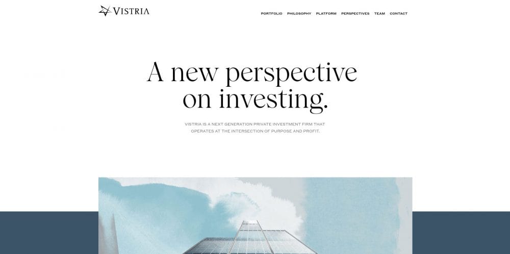
Why we love: If you’ve explored the world of private equity websites, it’s hard to find any that have this rare, yet personable quality: warmth. Vistria makes this list for that very reason. The intentional choice of custom watercolor illustrations, welcoming serif fonts, and a cozy color palette forms a familiar feeling; like a childhood friend. While exploring the site, you are not necessarily surprised by the visuals—because they did so well in maintaining their design system—but instead delighted to see that the same warmth of the homepage continues throughout your Vistria journey. This site gives a lasting impression that all PE firms should strive to accomplish if they want their audience to get to know their personality, not just their strategies.
– Maddy Kane, Lead UI/UX Designer
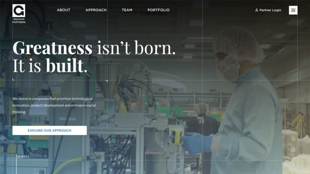
Why we love: Great work deserves credit where it’s due—even if it means occasionally singing our own praises. Coupled with a striking(ly relevant) hero image leveraging custom photography, a bold headline, and a unique grid motif, the Graham Partners website speaks directly to high-value prospects and audiences alike right away. We flexed our copywriting skills and invested time into developing strong positioning statements throughout the site that showcase both the value and personality that Graham Partners brings to the table. The aforementioned grid motif underscores the solid, analytical culture of this manufacturing sector specialist in a subtle, yet distinct, way that brings all the site elements together to make an impact.
– Emma Anderson, Digital Product Manager
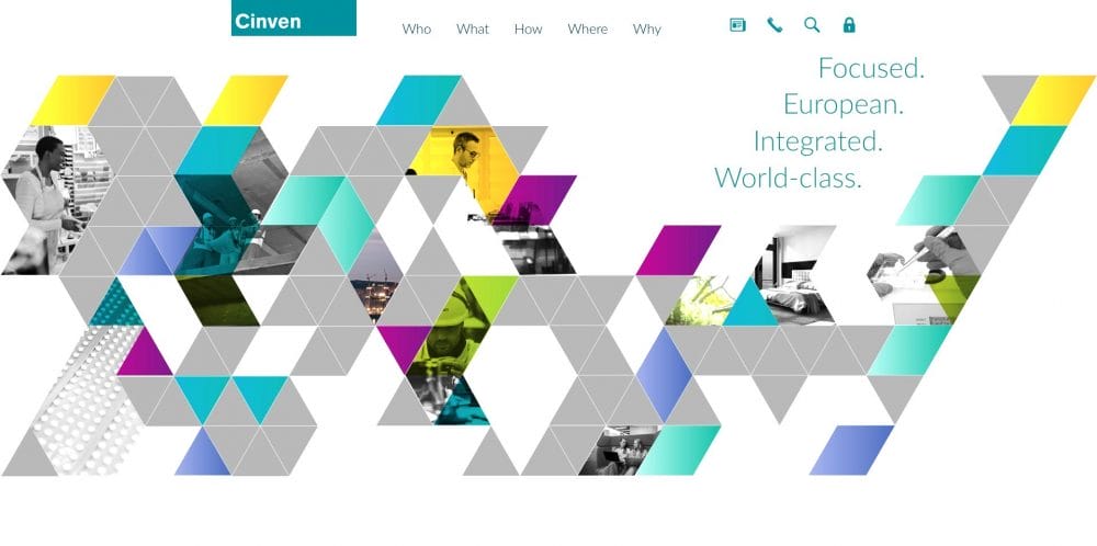
Why we love: A common theme you see across PE websites is the use of the color blue. While Cinven still utilizes blue as the primary color in the palette, they pair it with other bright colors for a fresh look. We don’t often get to see the yellows, greens, or pinks that Cinven uses and as a result, it helps them stand out. Along with their color choices, their frequent use of gradients makes content pop and helps highlight different sections. Aside from the color palette, Cinven paces content well and avoids large blocks of copy that could prevent users from staying engaged. They feature multiple types of content including statistics, maps, and highlighted sections to keep users reading, scrolling, and engaged while exploring the site.
– Noah Keen, UI Designer

Why we love: Updata breaks the mold of traditional PE websites by tapping into the thematics of their history and experience as software operators. As a firm that is strictly focused on growth investments in SaaS companies, the site leverages design motifs (including binary code that harks back to the first days of computer programming) that are relevant and instantly recognizable to those in the space. The copy, which uses a straightforward voice and tone alongside playful features such as a type-writer effect, makes this site one that speaks directly to its audience.
– Sean Hennessy, Digital Strategist
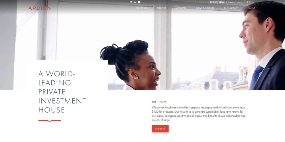
Why we love: Ardian uses a number of techniques to come off more uniquely than most other sites of its type. The most striking and powerful feature is the minimal color palette. Within most viewports, three, maybe four colors are used at the same time. It’s also unbelievably refreshing to not see blue anywhere. Their content also transitions easily to a mobile environment. Slightly more complex navigation or site structure can be a challenge, but they overcame this by using a very clean multi-screen mobile nav that functions very similarly to how an app might work. Overall, Ardian is a solid website with well-laid out content that is a joy to use.
– Wes Manley, Creative Director
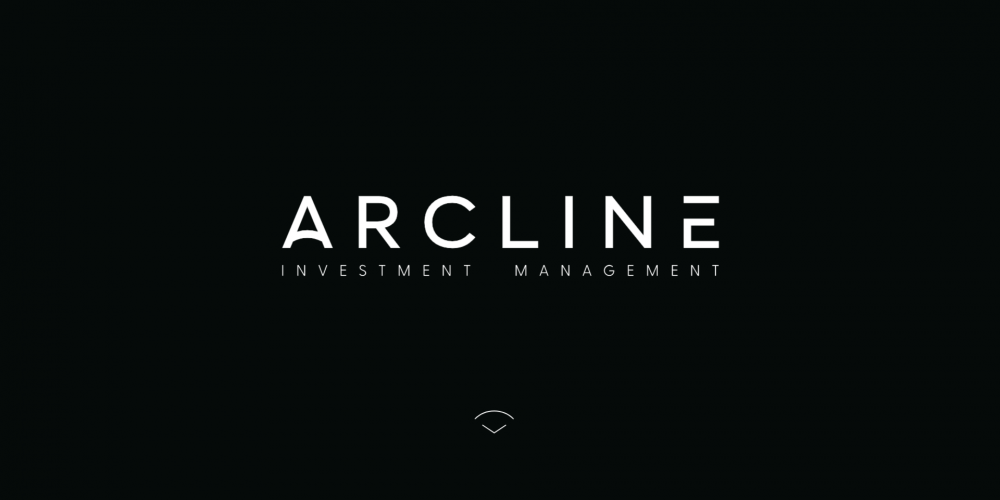
Why we love: Arcline made a smart choice with dark and bold heroes on each page that do their job of capturing your attention. The subtle animations as you scroll, coupled with the short and concise content, make it easy to take it all in while giving you a breather with the whitespace that surrounds their messaging. With the navigation being so simplistic, it leaves limited space for errors or confusion. Overall, keeping it clean and simple makes for an enjoyable experience all around.
– Kyle DeSimone, Front End Developer
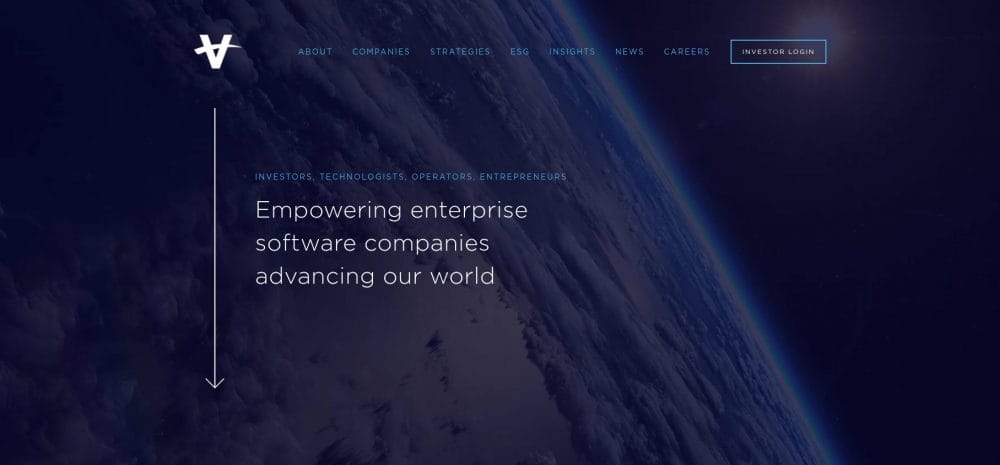
Why we love: You may have picked up on the fact that we have strong opinions about the industry’s oversaturation of the color blue but we love that Vista Equity Partners has found a balanced color palette featuring this widely used hue. Vista pairs sleek navy with more playful, sky blue accents that feels crisp and fresh. The effective use of CEO videos and testimonials across the site add a personal touch that lends credibility to their depth of sector expertise and commitment to advancing technology. Subtle animations and interactive elements, such as the Vista Ecosystem map and history timeline keep users engaged and delighted as they learn about the firm.
– Donna Blaszkowski, Digital Strategist
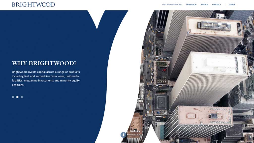
Why we love: A petite—yet uniquely expansive—web experience is just a scroll away with Brightwood Capital Advisors’ compact, one-page website. It manages to feel large and extensive through the use of innovative, scroll-based animations that takes users through a clear path. While the animations almost overwhelm the messaging, we respect its bold and assertive intent to stand out as atypical among other PE websites.
– Emma Anderson, Digital Product Manager
Now that you have design ideas to meditate on, the next step is to evaluate how your current website is serving your firm and what impressions it makes to visitors:
- Does your digital presence reflect your expertise?
- Does your website speak to your target audiences?
- Is technology or brand consulting part of your value-add and is it represented on your site?
- Does your website tell your story and portray who you are?
If visitors to your site don’t find the information that’s core to your business, they won’t be motivated to act. We can help you build a digital experience that speaks to your audience and captures their attention.
Subscribe to the infinite thread of thoughts in our heads
Subscribe to the infinite thread of thoughts in our heads
"*" indicates required fields
