Top 10 Best Venture Capital Websites
Venture capital is at the vanguard of business growth. But while you would expect many VC websites to have the same edginess that their business models demand, there is much room for growth across the board. To set the bar higher, we’ve rounded up 10 websites that we think exemplify VC’s spirit of innovation to give you inspiration for your own redesign.
Editor’s Note: This post was originally published in July 2020 and has been recently updated on March 30, 2022.
Your venture capital firm’s website is often one of the first impressions you have with potential partners. While a web redesign requires a great deal of thought, time, effort, and other resources, it can have an enormous impact in helping your firm stand out.
We’ve designed sites for many private equity and venture capital firms. We love working in this space because the clients who seek us out understand that good design is the core offering of all good businesses—including their own and the ones they nurture. They see great design not as a means to an end, but as an end itself. It goes beyond just “look and feel” to include all the elements of execution including messaging, branding, and content strategy.
Venture capital all is about the bleeding edge of growth. The risk is high but those willing to take the gamble are rewarded. This environment creates rich ground that fuels impactful design.
Here we round up our top 10 best venture capital websites for you to use as inspiration. When you’re ready to learn more, talk to us.
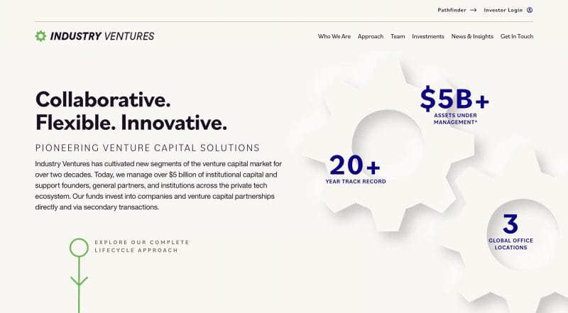
Why we love: Industry Ventures differentiates itself by delivering VC solutions across the entire venture lifecycle. We had the great opportunity to collaborate with the Industry Ventures team in creating animated explainer graphics that show how their approach is truly unique. Subtle animations that play off of their branding and elegant page-to-page transitions makes learning about the firm a delightful experience.
– Sean Hennessy, Digital Strategist
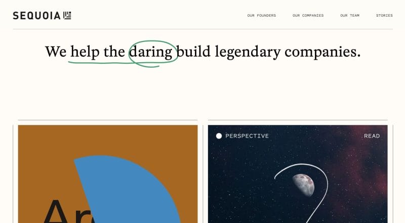
Why we love: Sequoia expertly blends together punchy headlines with an animated “marker pen” effect to create bold statements and a compelling first impression. The rest of the homepage, organized in a series of colorful and attractive tiles, serves as the perfect launching point to engage quickly with their content marketing efforts. From founder spotlights and industry articles to animated gifs that speak to Sequoia’s ethos, users are captivated by the personality and expertise that jumps off the page.
– Emma Anderson, Digital Product Manager
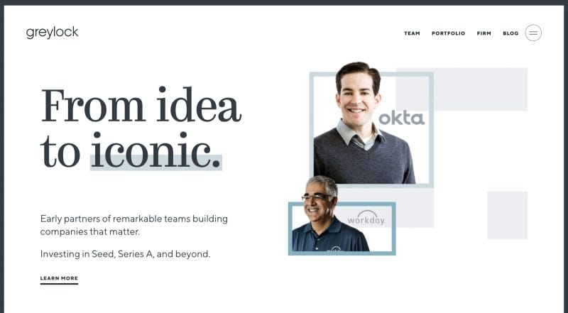
Why we love: Consistency matters in web design and Greylock’s site has it. From the initial framing to the concise headlines on each page, everything feels like it belongs together. Even the typeface pairing of a serif and san-serif is a nice take of blending old and new in a way that is not dated.
– Wes Manly, Creative Director

Why we love: Atomico’s homepage has gone through a few iterations over the years, but all of them offer something in common—engaging design. They make excellent use of video across key pages and the parallax scrolling animations below the fold are exactly how they should be used—nothing gratuitous about it. This site has a ton of content, so grab a cup of coffee before you sit down with this one. We’ve read through a good deal of it and can attest that it is worth it.
– Niall Durkan, Founder

Why we love: We love this site because it feels like a breath of fresh air in the VC world. The design gives plenty of space to breathe and allows content to be digestible and readable. Animations across the site are smooth and, together with a calming yet futuristic color palette, contribute to creating an enjoyable experience exploring each page. DNA Capital isn’t afraid to experiment with an unexpected portfolio layout on its Companies page, either. All things considered, DNA Capital’s site helps them stand out in the healthcare and healthtech market as true professionals who can be strong partners for their businesses.
– Noah Keen, UI Designer
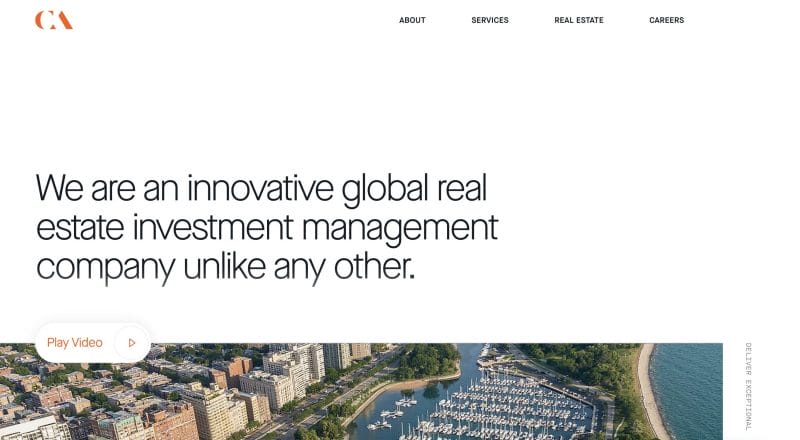
Why we love: CA Ventures moves away from the traditional blue/green venture capital color palette and acquires more of a lively, personable orange and black combo. Although some may think the colors are too bold, we would argue that CA Ventures is on this list because the palette makes it unforgettable. Alongside modern typefaces lives captivating and tailored photography that coordinates well with the straightforward messaging. The thin line element is a nice space for breath after the larger, chunkier aspects of the site. As a whole, the site leaves a warm, personable impression on the user that entices them to come back for more.
– Maddy Kane, Lead UI/UX Designer
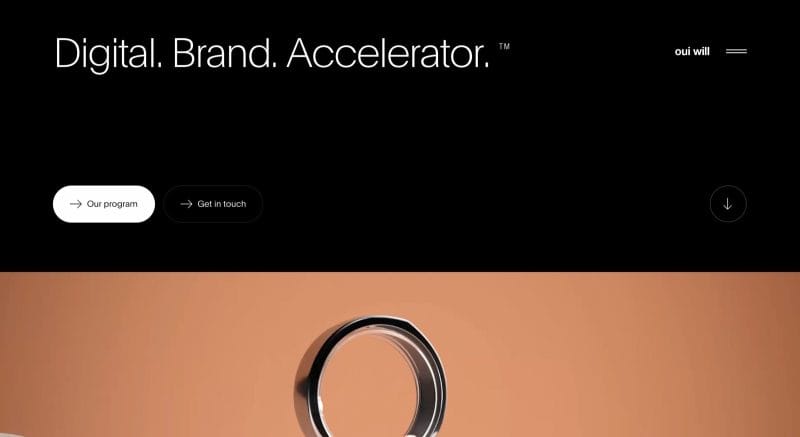
Why we love: Simplicity paired with bold motion makes Oui Will’s site both impactful and unique at the same time. We love the way the content sections switch from light to dark and use subtle motion and animations to keep you scrolling to see what’s next. The page-to-page animations also make it easy to understand where you are on the site and where you are going.
– Kyle DeSimone, Front End Developer
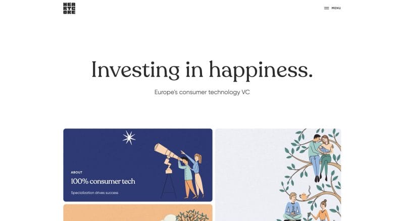
Why we love: Playful and dreamy illustrations take the stage in interesting shapes across Heart Core’s site, giving it a warm, approachable vibe that instantly sets it apart from other venture capital firm websites. Even its slightly retro font choice, Recoleta, wins points in the personality department. And, if you questioned Heart Core’s commitment to these whimsical designs, we’d guess you’ve yet to venture to the Team page. Illustrated portraits of the team members are a nice touch to tie into the illustrative design approach. Across the site, subtle, animated touches to the artwork give the pages an added richness.
– Craig Moscony, UI/UX Designer
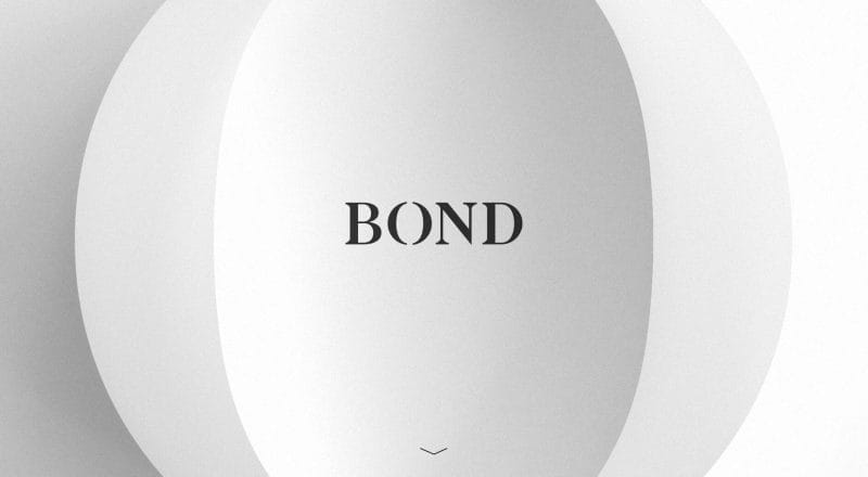
Why we love: The Bond Capital website exemplifies simplicity. Each section of the site takes up one single screen in each scroll. Almost nothing is there to distract the user from the content at hand—including a navigation or footer menu (which appears MIA). While the use of PDFs themselves leave us wanting more design-wise, we appreciate the guttiness and commitment to this simple design’s integrity.
– Wes Manly, Creative Director

Why we love: Peter Thiel’s firm is one of the largest players in venture capital and his site is as stylish and impressive as you would expect. We like the minimalistic approach which is paired with a visual boldness that communicates confidence and success. But, where this site really shines is in its branded content through its “Anatomy of Next.” Founders Fund has been at the vanguard of content marketing in the VC space for a long time. They understand that their expertise is the best brand ambassador that they have, and they share freely. Highly produced podcasts, videos, interviews, and articles are created on a regular schedule. The VC sales cycle is long and they know the best way to nurture partnerships is to offer thought leadership to companies in their nascent state. Founders Fund does the work now and reaps the rewards later.
– Niall Durkan, Founder
If your current site isn’t serving you, it may be time to think about a website redesign. But how do you know for sure when it’s actually time to get the ball rolling on an overhaul?
You can start by asking yourself questions like:
- Is my website representative of my VC firm on the whole?
- Does my site’s look and feel match my company’s voice? Does it speak directly to my target audiences?
- Do my call-to-actions convert visitors into leads and customers?
- Do my landing pages inspire people to learn more by digging deeper, or are they simply aesthetically pleasing pages that convey little value?
- Is my site navigation confusing?
- Is my important content hidden or is it missing entirely?
- Is my website responsive across devices?
- Can search engines find and index my content?
We can help you develop a digital experience that tells your unique story and compels your target audiences to take action.
Subscribe to the infinite thread of thoughts in our heads
Subscribe to the infinite thread of thoughts in our heads
"*" indicates required fields
