Top 10 Best Family Office Websites
A decade ago, family offices could get by simply putting up a basic website and relying on personal and business connections—but this is no longer the case. To remain competitive, family offices need to tap into the marketing toolkit basics, starting with their website. We’ve rounded up 5 website examples (and why we think they work) to give you inspiration for your own redesign.
Marketing has not been historically top of mind for family offices. But while private wealth management firms in the past have been able to get by without overtly promoting themselves or—even going as far as viewing elusiveness as a badge of honor—increased competition in the market is quickly changing the landscape.
To remain competitive, family offices must learn how to adopt the marketing toolkits other B2B businesses have spent decades implementing and dialing in. Beginning this process can be daunting at first, but ultimately, the best place to start is your biggest digital footprint—your website.
Most often, the first interaction your firm has with potential partners is through your website. (If you already have anonymous visitor tracking set up, this may not come as a surprise.) While a website redesign requires a considerable investment of time, effort, finances, and other resources, it can go a long way in helping you clearly communicate how your investment approach, company culture, and other differentiating factors set you apart in a way that resonates with potential partners.
We’ve designed many sites for family offices and its sister investment sectors, and have an intimate understanding of both this niche and in building digital experiences as a whole. From UX/UI strategy to website development and ongoing support, we can help you get started building a successful digital presence that acts as a credibility builder, information hub, and overall, a live, digital version of your family office.
While there is room for growth across the board in this industry, we’ve pulled a list of five examples (in no particular order) that can help spark inspiration for your own site. When you’re ready to learn more, talk to us.
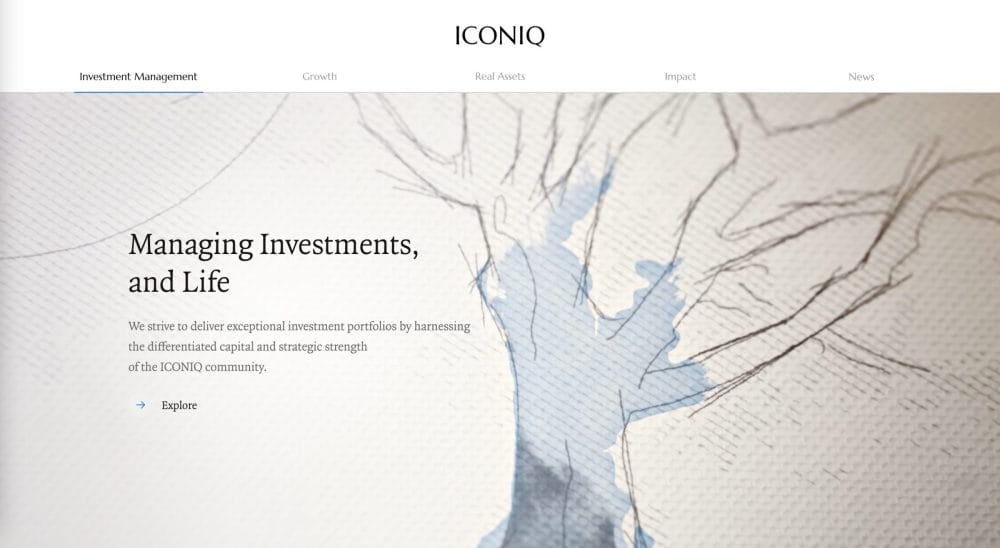
Why it makes the list: Right out of the gate, ICONIQ Capital differentiates themselves through the use of animated sketches and watercolor illustrations in the home hero and across the site. These home page illustrations not only visually reflect their visionary point of view, but it also quickly introduces users to the firm’s full breadth of offerings with the use of seamless animation.
At their core, ICONIQ Capital is invested in initiatives that compound business growth with altruistic efforts. They have even gone so far as to create a content hub that shares the impact of their collaborative philanthropy funds. ICONIQ Capital makes a conscious effort to put content first, which helps them not just talk the talk when it comes to their impact initiatives and private investments, but truly shows potential partners what they’re really all about.
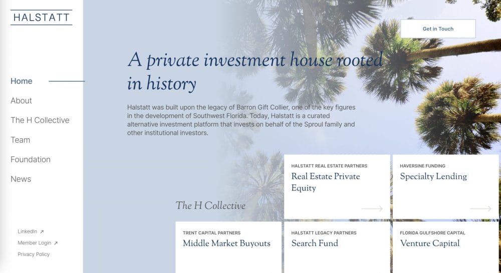
Why it makes the list: Halstatt isn’t your typical family office. As we came to learn more about their 100-year real estate legacy throughout Florida during this redesign, it was clear to us that, as the firm has grown, their focus has also evolved. Halstatt is now a curated, alternative investment platform with initiatives spanning real estate, private equity, sponsored buyouts, venture capital, and specialty lending. We worked with the Halstatt team to brand this innovative offering as the “H Collective.” Right away on the home page, users have quick access to learn more about each initiative.
It’s really no surprise that Halstatt ranks amongst the best family office websites. Their design strikes a balance between honoring the Halstatt legacy, while also leaning into the firm’s evolution with a clean and progressive design. As a woman-owned and led investment firm, the light and airy color palette gives the site a breath of fresh air. This combined with bright photography and clean typefaces provides a sophisticated, corporate look that’s not cluttered or stuffy. The branding across the site is also similar to, but differentiated from, its real estate sister site, Halstatt Real Estate Partners.
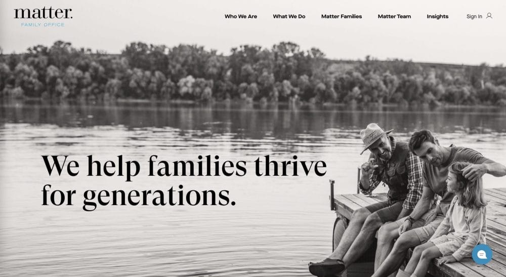
Why it makes the list: Matter Family Office’s website captures the essence of family—and in this industry, approachability is important. Family wealth management can be a relatively dry topic, but Matter Family Office leverages photography of tight-knit families to evoke warmth and a sense of purpose for the user. After all, it’s not just about financial management, it’s about setting up a legacy for their families to thrive in the future.
Matter Family Office adds an additional dimension to this narrative with its “Matter Families” content, which presents challenges from the user’s point of view and shows how the Matter Family Office team has helped similar families tackle them. Across the content of the site, they use a welcoming and supportive tone of voice that helps to further make the user feel like they are in good hands.
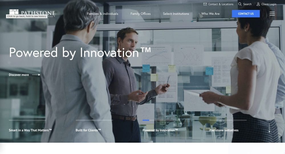
Why it makes the list: If we had to describe Pathstone’s website in one word, it would be: polished. Its simple and clean design strips away all things gratuitous, leaving behind a streamlined site that focuses on its key messaging and nothing more. The site leans on subtle design elements, and clear text hierarchy to make an impact with this messaging. Photography across the site is used more sparingly, but where it matters. Its homepage heroes are not only nice visuals, but also help to quickly communicate at a glance their branded core offerings and overall value proposition.
Most of all, they rank among the best family office websites because of their utilization of content marketing. Pathstone frequently publishes perspectives, market reports, and ESG-focused articles as a central way to demonstrate and build credibility with potential clients. By the time the user finishes browsing through a selection of them, Pathstone naturally emerges as a go-to partner that leads its investments with insights.

Why it makes the list: Chances are, you’ve heard of the Rockefeller name. This global family office leans into this legacy and solidified track record with their website, touting their work with the Rockefeller family as the firm’s ultimate blueprint. Rockefeller Capital Management is upfront with their vision, mission, and purpose and backs these claims throughout the site with the use of testimonials from Rockefeller family members.
Keeping things simple, the main navigation is stripped back, while its sleek takeover menu gives users quick access to dive deeper into specific page sections. Paired with a clean and consistent text hierarchy, the site offers a streamlined experience that balances its wealth of content.
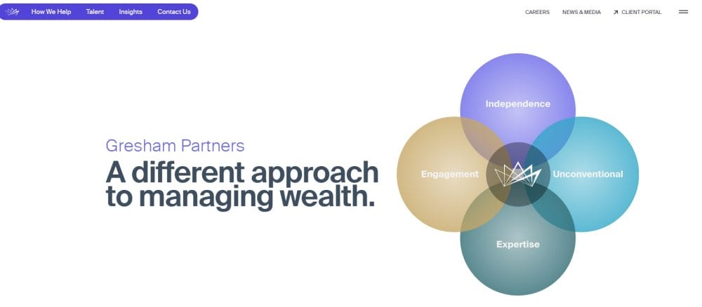
Why it makes the list: Disclaimer: This one’s close to our heart—we’re proud to enjoy a great relationship with Gresham Partners. They’ve clearly embraced and invested in building a strong digital presence that reflects their core values. From the moment you engage with their site, it’s evident that what sets Gresham apart isn’t just their services, but the principles guiding them.
What makes Gresham’s site truly exceptional is how it achieves something few family office websites manage: communicating their value proposition seamlessly online. The design is clean, user-friendly, and free of clutter, ensuring users can explore their offerings with clarity and ease. It’s a perfect example of how thoughtful digital strategy can reinforce trust and distinction in a competitive space.
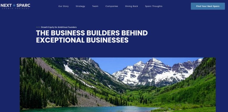
Why it makes the list: In the world of family office websites, few offer the same welcoming experience as the homepage of Next Sparc Growth Partners. From the start, the site taps into emotion, giving visitors a glimpse of the possibilities that come with partnering with Next Sparc. It’s not just a website—it’s an invitation to imagine what can be achieved together.
Next Sparc’s approach goes beyond delivering information; it inspires action by showing users the impact of collaboration. This emotional connection, combined with a seamless design, makes the site stand out in a space where truly engaging digital experiences are hard to come by.

Why it makes the list: Great work deserves recognition—even if that means singing our own praises now and then. The homepage delivers a sleek, smooth scrolling experience, enhanced by a soft color palette that reflects the brand’s commitment to simplicity and longevity. The thoughtful design ensures every element feels intentional, reinforcing the company’s values from the moment users arrive.
The site’s well-organized structure makes navigation effortless, guiding visitors to key content with ease. It also excels in content marketing through its news section, offering valuable insights that keep users informed and engaged. This combination of intuitive design and relevant content creates a polished, professional experience that reflects the brand’s commitment to excellence.
Why it makes the list: When you land on the Crosby Advisors homepage, you’re immediately met with a sense of warmth and comfort. From the first click, the site sets the tone for a friendly, client-first experience. It’s not just about numbers or portfolios—it’s about building a partnership centered on you and your future. Crosby Advisors makes it clear that their mission is to help you unlock the possibilities ahead through personalized guidance and a strong collaborative approach.
The website’s structure is both intuitive and thoughtfully designed. The menu is simple to navigate, giving you quick access to key sections that introduce Crosby’s team, philosophy, and process. Whether you’re exploring their financial expertise or getting to know the advisors on a personal level, the site offers a clear, no-frills path to the information you need.
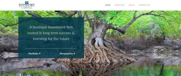
Why it makes the list: Bayshore Capital’s website combines captivating design with actionable insights, reflecting the firm’s culture of curiosity and diligence. From the homepage, visitors gain direct insight into the partners, philosophy, and personalities that define the firm, fostering trust and connection. This transparency sets Bayshore apart, allowing users to envision themselves working with a team committed to excellence.
The site’s detailed portfolio highlights showcase successful investments, building confidence and excitement about the possibilities of partnering with Bayshore. By balancing engaging design with meaningful content, the website creates a seamless experience that communicates both expertise and opportunity, leaving visitors inspired and eager to explore what’s possible with Bayshore Capital.
These website examples make it clear: there is no single blueprint to the best family office websites. More importantly, your website should take on a customized approach to highlight the differentiating factors of your firm and make it memorable and unique to your audience.
If you’re unsure if your website is putting your firm’s best foot forward, asking yourself the following questions can help you approach this decision tactically:
- What business goals do I have for the website that aren’t being met by the current version?
- How do these goals align with other business development or marketing goals?
- Does my website speak to my firm’s core audiences and address their pain points?
- Does my current website help answer commonly asked questions from potential partners?
- Visually, does the website reflect who our firm is and where we’re headed in the future?
- Is our team at a point where we are ready to invest the time and effort into a redesign?
When it comes to a website redesign, it’s crucial that your site not only visually reflects your family office, but also speaks directly to your audience, succinctly addresses their pain points, and supports their user journey. We can help you get it right. Drop a message to connect or subscribe to our newsletter to get digital-first insights delivered straight to your inbox.
Subscribe to the infinite thread of thoughts in our heads
Subscribe to the infinite thread of thoughts in our heads
"*" indicates required fields