forcine
Forcine is a 100% employee-owned concrete construction company with more than 50 years of experience delivering complex concrete work across industrial, commercial, cold storage, and capital improvement projects. As the company’s capabilities and reach grew, its brand needed to grow with it, and a recent acquisition added a strategic question of its own. We partnered with Forcine on a complete rebrand and website redesign, guiding the work from discovery and brand strategy through visual identity, UX/UI design, and development. The result is an identity that feels historic, thoughtful, and ownable, supported by a site built to carry the business forward.
Shortly before our engagement, Forcine acquired R&W Shotcrete, a specialty concrete company specialized in shotcrete, and needed to decide what role the R&W name would play going forward. We took the question into a dedicated strategy workshop and laid out three possible futures. R&W could remain a standalone brand, live under Forcine as a sub-brand, or become part of Forcine entirely. Each option was weighed against what discovery had already revealed through stakeholder interviews, surveys, competitive analysis, and market research.
The findings made the path clear. R&W’s reputation lived largely in individual relationships rather than in the name itself, and maintaining two brands would have stretched a lean marketing team thin while dividing search visibility between two sites. We recommended full integration. The R&W name was retired, its specialty services became part of Forcine’s offering, and its history was carried forward on the new Forcine site so that legacy wasn’t lost along the way.
Forcine sets a high bar on every project, and we held ourselves to the same standard. Early in our collaboration, the idea of a cornerstone kept surfacing. It describes the literal foundations Forcine pours as much as the steady support they give their clients, and it became one of the bedrocks of the new visual brand identity. The concept took shape in a simple logo mark defined by sharp angles and technical precision.
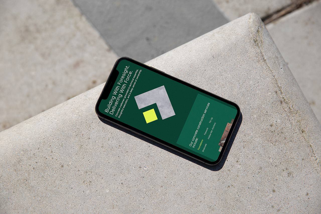
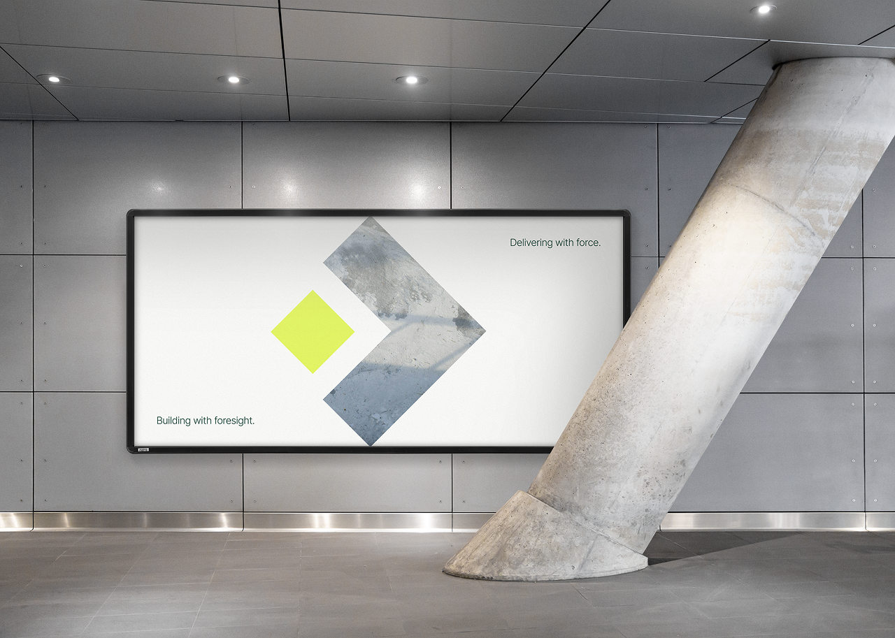
Every brand decision was filtered through Forcine’s new tagline, Building with foresight, delivering with force. Foresight is what Forcine brings before the concrete work even begins, with carefully sequenced schedules, estimates clients can rely on, and issues caught early while they’re still easy to solve. Force is the scale, strength, and grit they bring to the jobsite to execute at a high standard every time. The brand voice follows suit, speaking with the measured confidence of a seasoned professional who has seen it all yet stays humble and forward-looking. Throughout the identity, Forcine’s legacy of precision, innovation, and trusted partnership guided the work.
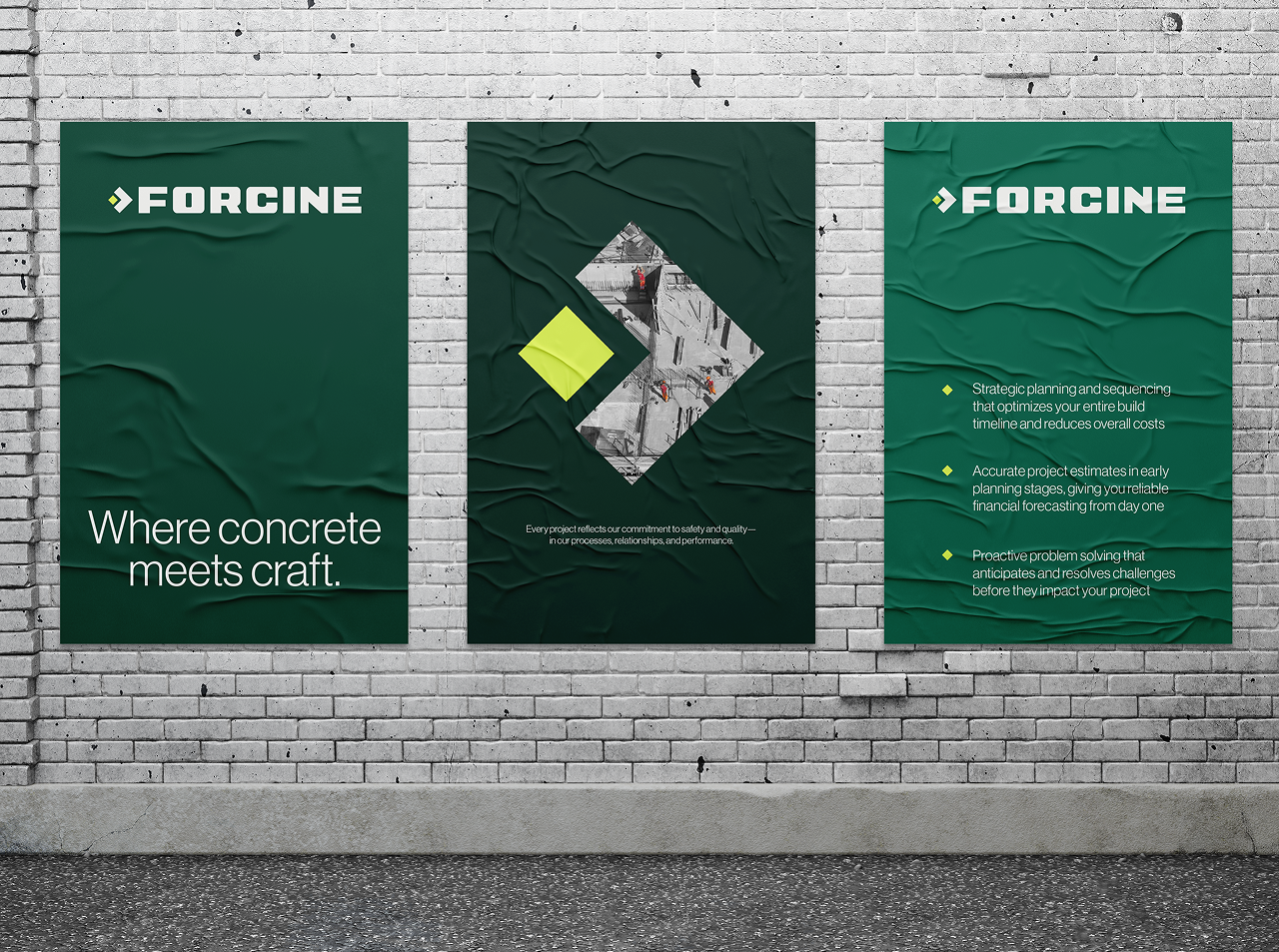
In an industry where attention to detail is everything, we saw a clear opportunity. Few companies in the space gave their own visual identities the same level of care they bring to their work. Through discovery workshops, stakeholder surveys, and creative collaboration sessions, we built a blueprint for using Forcine’s inherent strengths to elevate the brand above its competitors.
Forcine has been known for years by its signature green. To honor that legacy, we built a color palette around the historic color and expanded it with Concrete (a self-explanatory inclusion) and Safety Citrine, a much-needed bright accent rooted in the company’s dedication to safety.
To build brand equity, we extended the cornerstone well beyond the logo. The mark now frames photography, organizes lists as a custom bullet point, and signals action-oriented items throughout the new website.
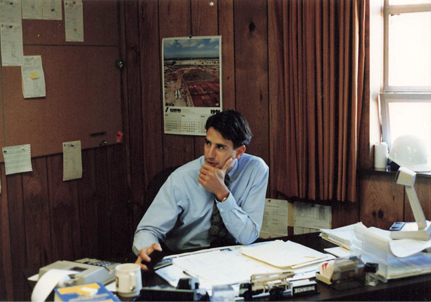
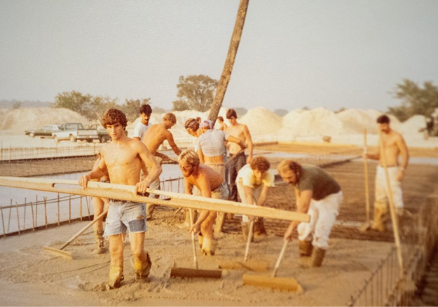
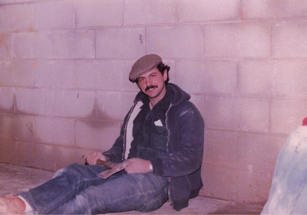
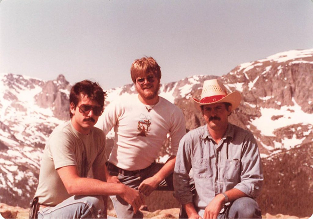
As an employee-owned company, Forcine’s people are its foundation, and the visual language and website experience reflect that. A personable tone of voice, historical photography, and the faces of the team all make it clear that Forcine would be nothing without the skilled craftspeople who make up the company.
A brand this considered needed a website that worked just as hard. The new site had to absorb R&W’s services, present Forcine’s capabilities with clarity, and leave room for whatever the company takes on next, all without fragmenting into a scattered collection of pages.
Before we could design the sitemap, we needed a shared definition of what Forcine actually does. In a collaborative workshop, we mapped every service and specialty on two scales, one measuring how traditional or disruptive the approach is and one measuring how mainstream or niche the market is. Seeing offerings like flatwork, tilt-up, foundations, shotcrete, soil stabilization, and concrete repair side by side helped Forcine narrow its focus to the services that matter most to its business. That clarity shaped a streamlined navigation built around services, markets, projects, company, careers, and contact.
Services hold the primary spot in the navigation, with a dedicated overview page that offers clear entry points to each of Forcine’s five core services. Whether a visitor knows exactly what they need or is still exploring, the path to the right capability is short. Each service page is built to demonstrate expertise rather than simply describe it. Rich photography and drone footage from real worksites sit alongside Forcine’s approach, what sets them apart, a breakdown of capabilities, and related projects that prove the work in practice.
For visitors who think in terms of their industry first, markets offer another way in. Following the same structure as services, a dropdown menu and overview page lead to dedicated pages for industrial, commercial, cold storage, and capital improvement work. Each market page opens with a forecast written by a Forcine team member, showing that the company stays informed on the trends shaping its clients’ industries. Scope components and industry standards add technical depth, and testimonials reinforce the trust Forcine has earned in each market.
New services and markets fit into the existing structure, keeping the site coherent as Forcine continues to grow and evolve.