48north
Private equity advisory has a reputation problem with the people it’s supposed to serve: high fees, unsolicited offers, and a lot of noise. 48North’s founders set out to be the exception, a team of reformed finance professionals and first-time founders themselves who understood the hustle because they were living it. The challenge was translating that into a brand. Too polished, and 48North reads like every other advisory shop business owners are tired of hearing from. Too scrappy, and they risk not being taken seriously by the institutional buyers writing the checks.
Through stakeholder interviews and workshopping with the team, a clear tension emerged at the center of the brand: approachable, yet reputable. Every decision, from the mark to the type to the voice, had to hold both ends of that line at once.
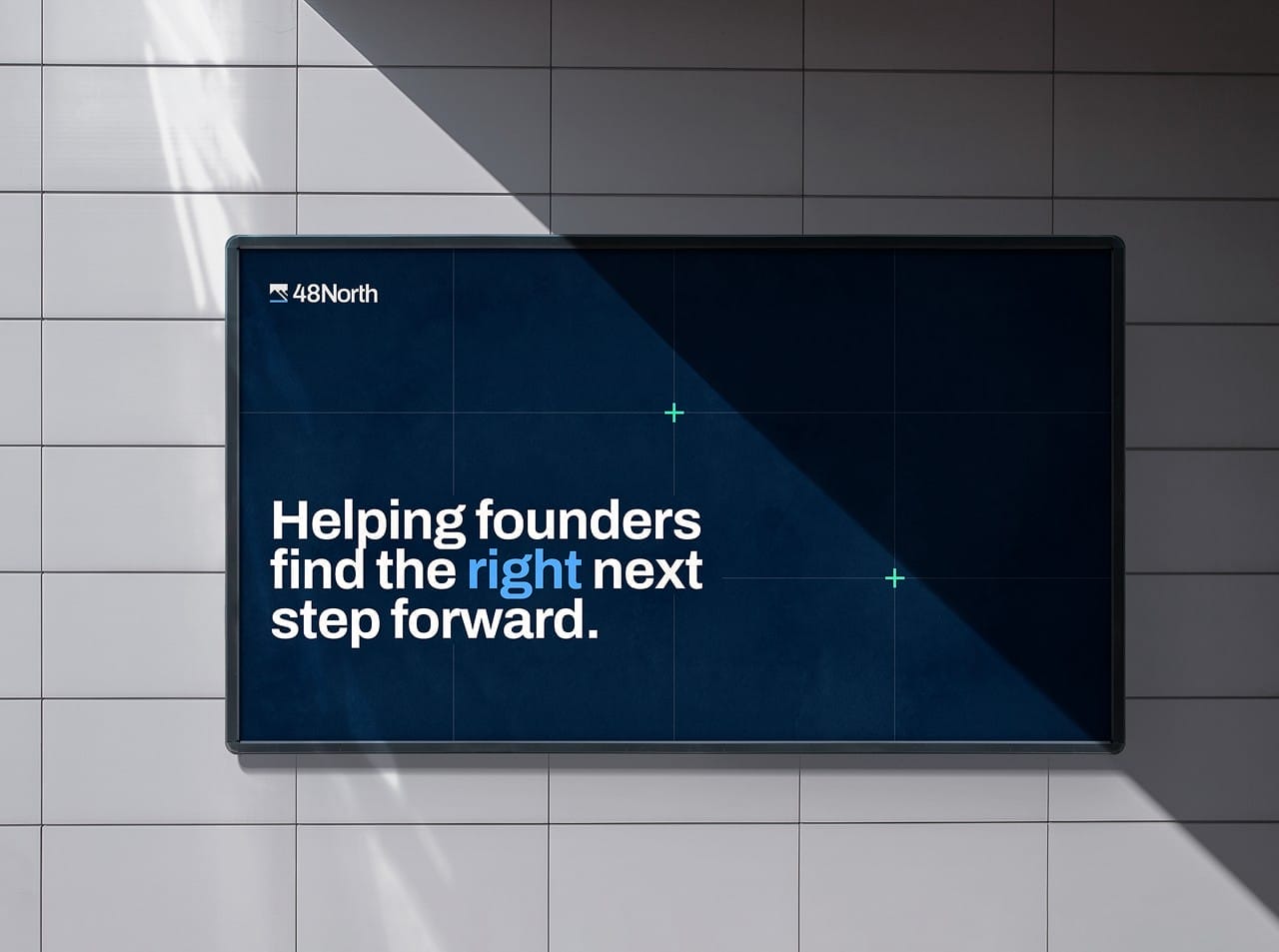
48North needed an identity that could hold a boardroom conversation and a backyard conversation in the same breath: credible enough for institutional buyers, human enough for the owners who built their businesses by hand.
We built this system the same way 48North builds trust: one intentional decision at a time. Nothing in the identity was left to default. Every mark, every interaction, every shade of color had to earn its place by serving both sides of that conversation at once.
The mark draws from Triple Divide Peak, the rare point where water splits and flows to three different oceans, a fitting metaphor for a firm that helps owners find their own path forward. That idea carries through the site’s navigation, designed to feel like a map of the journey, with a signature plus button guiding visitors at every turn.
Subtle, unexpected interactions are woven throughout the site, giving what could be a static, buttoned-up experience a sense of movement and personality at every scroll.
The type system leans strong and confident, doing the heavy lifting on hierarchy. The deep navy stays true to the traditional private equity world 48North operates in, while a refreshed green signals the innovative, founder-first approach that sets them apart.

We make finding the right investor partner straightforward, offering expert guidance through each step of the process, honest answers to complicated questions, and introductions to investors who value what you’ve created.