next sparc
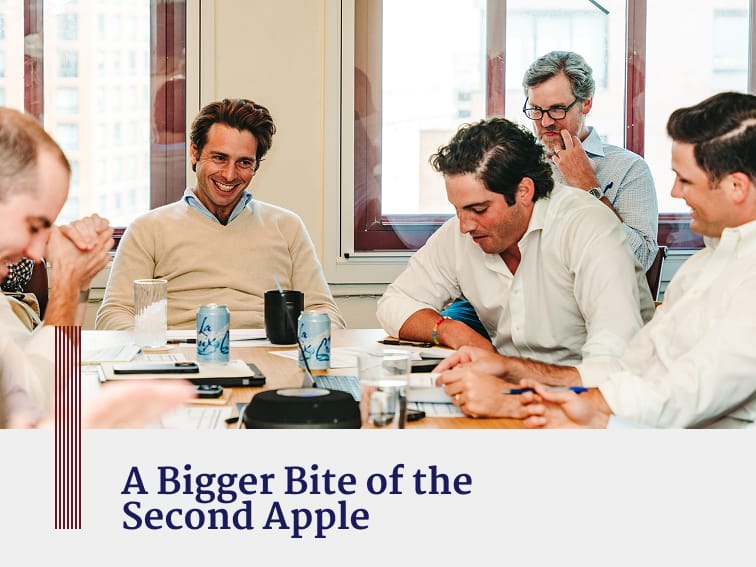
Next Sparc knows how to help companies reach new growth, but when it came to their own brand identity, it lacked the spark we saw when meeting the team. We worked to create a bolder brand presence with a website that positions Next Sparc as a professional family office that works—and plays—hard.

As a newcomer to the growth equity world, Next Sparc, a first-generation professional family office, lacked a sense of brand apart from its logo. Finding inspiration in the firm’s entrepreneurial origin story and lively personality, we crafted a bold yet approachable visual design language and brand voice that puts the team’s palpable energy on display. Subtle microcopy moments, like the use of the Sparc symbol as an asterisk, allowed Next Sparc say a little extra where it matters.