asante
Asante is a leading, independent global advisory and private markets placement firm. As the firm continues to grow, they were looking for a refreshed brand that exemplified their commitment to providing the highest level of service to clients across the globe. The new visual language guides both Asante and their partners towards a bright, successful future.
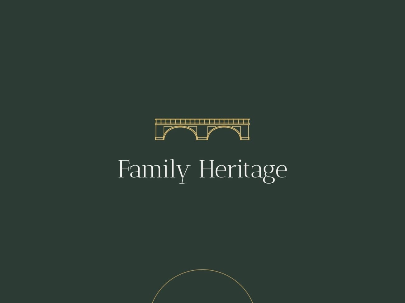
Rooted in the founding partner’s sailing background, the refreshed brand illustrates the strength and guidance Asante provides their partners in navigating the complex waters of private equity fundraising. Inspired by the northern point of a compass, the all capitalized A’s set the tone for an impactful logo mark. Flourished with an orange mark across the top of the E (a visual dubbed “the horizon”) the visual accent is a nod to the correct pronunciation of Asante.
Rounding out the system of logos, a simple circle encasing the simplified A creates a powerful yet timeless mark that visualizes the stamp of Asante excellence.

For over two decades, Asante has worked with ambitious private equity firms to exceed aspirations and grow enduring franchises. Our success is hinged off our hybrid approach and personalized perspective.

Through a series of collaborative work sessions and detailed interviews, we began to see the common threads in the most important aspects of telling the Asante story. The firm is dynamic and approachable, calm and precise. Their global presence is powerful, and the refreshed brand had to reflect as such.
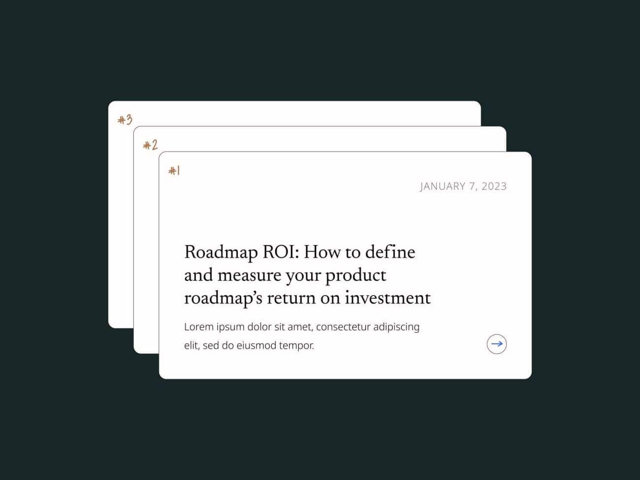
When it came to developing the visual language, every single decision had to be carefully considered and intentionally crafted. Doing less with more became a mantra of this creative process, yielding an approachable brand without any unnecessary complexity.
Creating a color palette that would stand out amongst the sea of blues in the competitive landscape was a key focus of the brand refresh. Rooted in calm neutrals found on the shores of the ocean, the palette is built around a deep sea green, Midnight Harbor, and a strong oceanic blue, Anchor Point. Accented by the rays of a warm sunrise, Horizon Glow adds a welcome contrast to the cool palette.
As the compass was a huge source of inspiration for the refresh, circles slowly became an important theme in the brand. To represent both the full circle service Asante provides their partners and the ways they break outside of the mold, a custom icon library was created.
Using simple flat shapes, a bold and dynamic pattern was created. Titled “the compass,” these circles can be used in infinite arrangements to both mask photography and craft static, or moving, patterns.