updata
Updata Partners is a leading technology-focused growth equity firm in Washington D.C. with over $3 billion in committed capital. Having built their last site together, they trusted us to return and evolve it alongside the firm. We evaluated and refreshed their brand from the ground up to craft an intentional identity that feels wholly Updata.


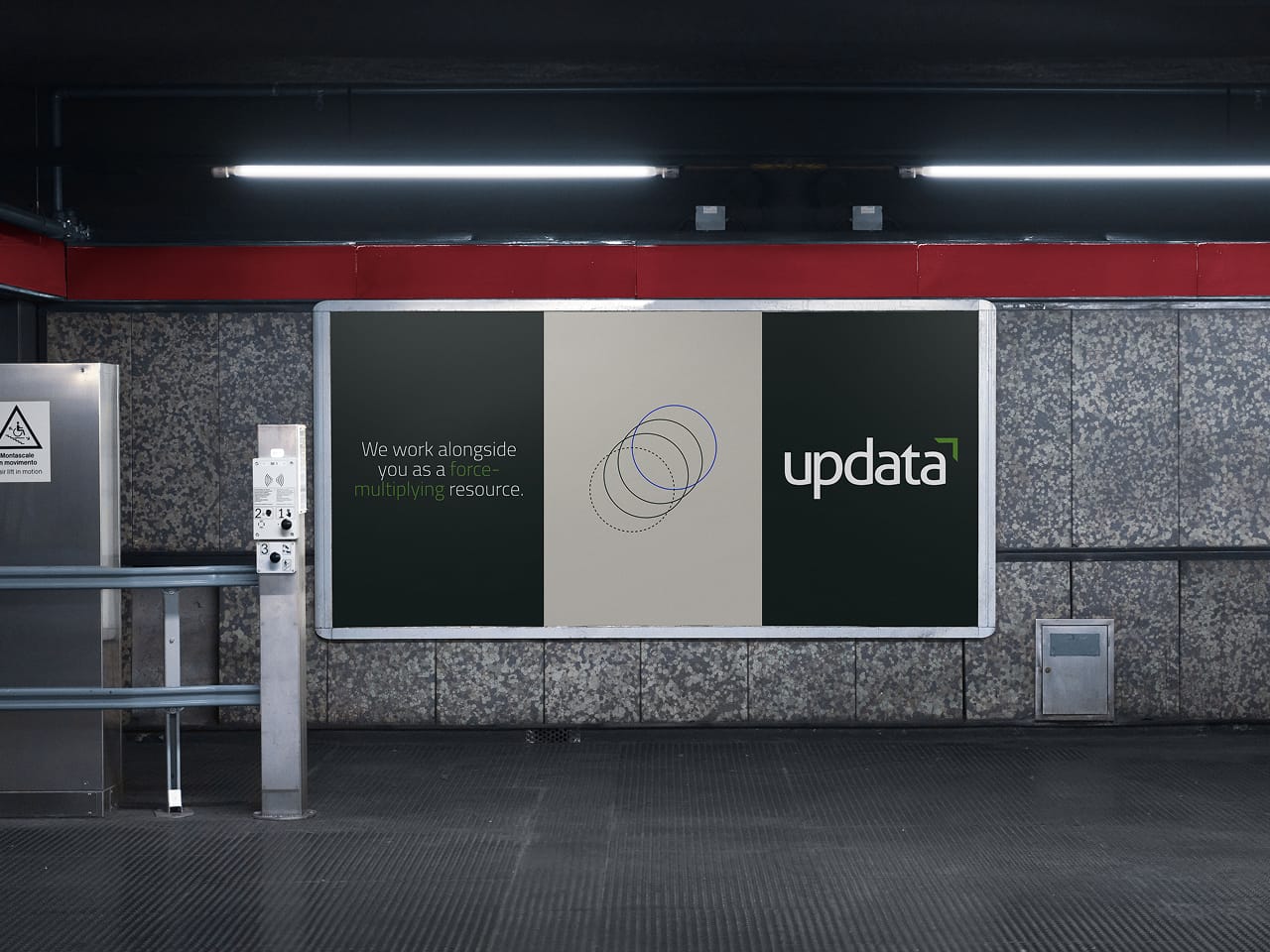
At the core of our visual identity work was a central goal of establishing Updata as a streamlined, reputable firm with a respected history in their industry. Our approach leaned into doing more with less: a simple, high-contrast color palette, unique typeface and custom illustration library. A tighter brand kit, built from fewer but more deliberate elements, gave the identity the clarity and staying power to grow with the firm.

Updata partners with ambitious, founder-led B2B software companies, located far and wide, wherever they may be.
Returning to working with Updata six years later, we already understood the firm’s roots, but our discovery process revealed just how much the firm had grown into itself. They had a proven track record, a genuine operator’s mindset, and deep loyalty from the founders they backed. What Updata lacked wasn’t substance. It was a visual language that could hold all of that credibility and broadcast it clearly.
The design challenge was one of translation. We took a culture that was intentionally humble and behind-the-scenes and expressed it with the confidence it had earned. Every element in the refreshed system was chosen with purpose, grounding Updata in its software identity while projecting the kind of authority that makes a founder take notice.
Subliminal but intentional nods to software informed the refreshed color palette. Based in deep, rich greens and greys, the dark tones in the palette are inspired by the background of a computer screen. Layered on top of this foundation are vibrant shades of green and purple: Legacy, Pixel and Accelerate. These colors draw from bright pixels and lines of code, weaving Updata’s software focus into each aspect of the visual language.
The Updata type system is driven by Cairo, a contemporary font that puts a modern spin on the firm’s software focus. Used exclusively for headlines, the distinctive, geometric letterforms serve as their own unique visual identifier.
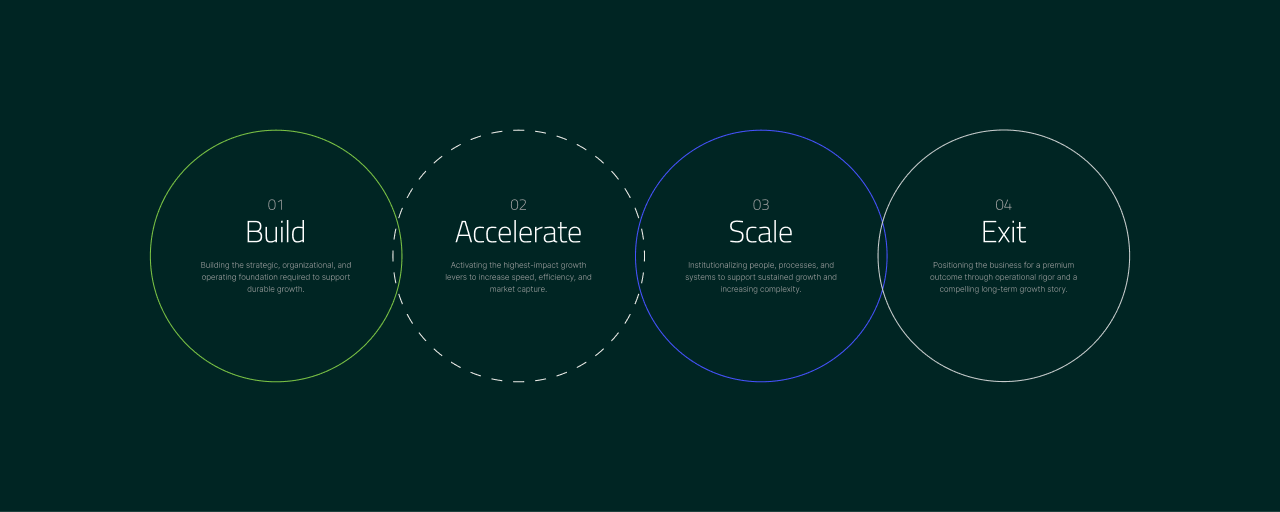
The custom illustration library is minimalistic and dynamic, each one crafted from simple shapes in thin, single pixel lines. The illustrations represent Updata’s dynamic energy, layered approach, and intentional decision making. On the site, the illustrations serve both as individual visuals and as containers for content, brought to life through subtle yet impactful animations.